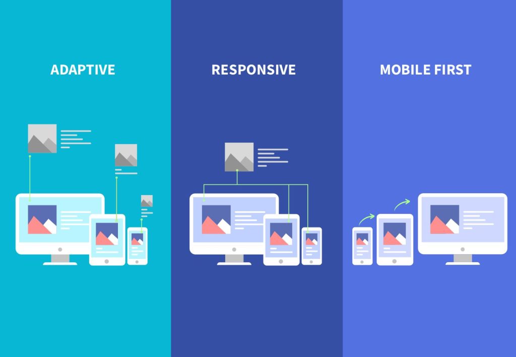
In today’s digital age, creating responsive and adaptable web designs is essential to provide an optimal user experience across a multitude of devices. Advanced CSS techniques play a pivotal role in achieving this goal by enabling developers to craft layouts and styles that seamlessly adjust to varying screen sizes, resolutions, and orientations. From media queries and flexible layouts with Flexbox to grid structures using CSS Grid Layout, these techniques empower designers to create visually appealing and user-friendly interfaces that cater to the diverse needs of modern users. In this comprehensive guide, US Logo and Web helps us to discover into key headings that cover advanced CSS techniques for responsive design, offering insights and best practices to help you build responsive and engaging web experiences.
1. Media Queries: Creating Responsive Designs
Media queries are a fundamental aspect of modern web design, allowing developers to tailor styles based on the characteristics of the user’s device. They are particularly crucial for creating responsive designs that adapt gracefully to various screen sizes, resolutions, and orientations.
One of the primary uses of media queries is to apply specific styles when the screen size falls within certain ranges. For example, you can target smaller screens with rules like @media screen and (max-width: 768px) to adjust the layout, font sizes, or hide certain elements to optimize the user experience on mobile devices.
Media queries are not limited to screen width; they can also target other features such as height, aspect ratio, resolution, and even the user’s preferred color scheme (light or dark mode). This flexibility enables designers to create versatile and adaptive layouts that cater to diverse user preferences and device capabilities.
2. Flexible Layouts with Flexbox: Enhancing Responsiveness
Flexbox is a powerful layout model in CSS that simplifies the creation of flexible and responsive designs. It provides a more efficient way to distribute space among items in a container, making it ideal for building navigation menus, grids, and other dynamic layouts.
One of the key features of Flexbox is its ability to automatically adjust item sizes and positions based on available space. This makes it perfect for responsive designs, as elements can rearrange themselves fluidly to fit different screen sizes without the need for complex calculations or media queries.
By using Flexbox properties like display: flex, flex-direction, justify-content, and align-items, developers can create responsive layouts that adapt seamlessly to varying viewport sizes. This flexibility not only improves the user experience but also simplifies the web development process by reducing the reliance on fixed-width designs.
3. Grid Layout: Building Responsive Grid Structures
CSS Grid Layout is another powerful tool for creating responsive web designs, especially when dealing with complex grid-based structures. Unlike Flexbox, which focuses on one-dimensional layouts, Grid Layout allows for both rows and columns, making it suitable for building sophisticated grid systems.
One of the key advantages of CSS Grid is its ability to define explicit grid tracks and gaps between them, providing precise control over the layout’s structure. This makes it easier to create responsive grids that adapt to different screen sizes while maintaining alignment and spacing consistency.
By using properties like display: grid, grid-template-columns, grid-template-rows, and grid-gap, developers can create responsive grid structures that automatically adjust based on available space. This is particularly beneficial for designing complex web applications with multiple content sections or data tables.

4. Viewport Units: Scaling Elements Responsively
Viewport units (vw, vh, vmin, vmax) are relative units in CSS that allow developers to size elements based on the viewport dimensions rather than fixed pixel values. This makes viewport units ideal for creating responsive designs where elements scale proportionally with the screen size.
For example, using font-size: 5vw for typography ensures that text scales smoothly as the viewport width changes, maintaining readability across different devices and resolutions. Similarly, using width: 50vw for containers makes them occupy half of the viewport width, creating a responsive and fluid layout.
Viewport units are particularly useful for responsive typography, spacing, and layout dimensions. They provide a more dynamic and adaptable approach to styling elements, reducing the need for extensive media queries and improving the overall responsiveness of the design.
5. Fluid Typography: Ensuring Readability on All Devices
Fluid typography is a key aspect of responsive design, ensuring that text remains legible and visually appealing across various devices and screen sizes. Unlike fixed font sizes, which may appear too small or too large on different devices, fluid typography scales seamlessly based on the viewport size.
Using relative units like rem or em for font sizes allows developers to create scalable typography that adjusts proportionally to the parent container’s font size. This approach maintains the hierarchy and readability of text elements while ensuring a consistent visual experience across devices.
For example, setting font-size: 2rem for headings ensures that they are twice the size of the parent element’s font size, making them responsive and harmonious with the overall design. Combining fluid typography with other responsive techniques like media queries and viewport units enhances the design’s adaptability and accessibility.
6. Responsive Images: Optimizing Visual Content
In the realm of responsive design, optimizing images for different screen sizes and resolutions is crucial for enhancing performance and user experience. Responsive images adapt to the available space on the user’s device without compromising quality or loading times.
One of the primary techniques for responsive images is using the max-width: 100%; style, which ensures that images scale down proportionally to fit their containers. This approach prevents images from overflowing or causing layout issues on smaller screens while preserving their visual clarity.
Additionally, HTML attributes like srcset and sizes allow developers to provide multiple image sources based on device characteristics such as pixel density (x descriptors) and viewport width (w descriptors). This enables browsers to choose the most appropriate image version for the user’s device, optimizing both visual quality and performance.
By implementing responsive images effectively, in web development service developers can deliver compelling visual content that adapts seamlessly across a wide range of devices, from large desktop screens to mobile devices, without sacrificing speed or clarity.
7. CSS Variables: Dynamic Styling for Responsive Design
CSS custom web development properties, also known as CSS variables, offer a powerful way to manage and apply dynamic styles in responsive designs. Unlike traditional static values, CSS variables allow for reusable and adjustable properties that can be updated dynamically through JavaScript or media queries.
One of the key benefits of CSS variables in responsive design is their ability to streamline style management and facilitate design consistency across different screen sizes. By defining variables for colors, fonts, spacing, breakpoints, and other design elements, developers can create more adaptable and maintainable CSS code.
For example, defining a color variable like --primary-color: #007bff; and using it throughout the stylesheet ensures consistency and makes it easier to update the primary color across the entire design. Similarly, using variables for breakpoints (--breakpoint-sm, --breakpoint-md, etc.) simplifies responsive design implementation.
CSS variables empower developers to build more flexible and scalable designs that respond effectively to varying viewport dimensions and user preferences. They promote code modularity, reusability, and efficiency, contributing to a smoother and more agile development process.

8. Mobile-First Approach: Prioritizing Mobile User Experience
The mobile-first approach is a design philosophy that emphasizes designing for mobile devices first and then scaling up for larger screens. This strategy prioritizes the mobile user experience, considering the constraints and capabilities of smaller screens before addressing desktop or tablet layouts.
By starting with a mobile-first mindset, designers and developers can focus on essential content, streamlined navigation, and optimized performance for mobile users. This approach encourages simplicity, efficiency, and user-centric design principles, leading to better overall usability and satisfaction.
One of the key advantages of the mobile-first approach is its compatibility with responsive design principles. By designing for smaller screens initially, developers can create leaner and more efficient code that adapts smoothly to larger screens using media queries and responsive techniques.
Furthermore, the mobile-first approach aligns well with modern web trends, where mobile traffic often surpasses desktop usage. Prioritizing mobile user experience not only improves accessibility and engagement but also future-proofs designs for evolving device landscapes.
9. Progressive Enhancement: Graceful Degradation for All Devices
Progressive enhancement is a design strategy that focuses on delivering a baseline experience to all users while progressively enhancing the experience for devices that support advanced features. This approach ensures compatibility and accessibility across a wide range of devices, from older browsers to modern smartphones.
One of the core principles of progressive enhancement is starting with semantic HTML markup and basic CSS styling that provides a functional and accessible experience for all users. Then, additional layers of enhancement, such as JavaScript interactivity or advanced CSS effects, are added for capable devices.
By implementing progressive enhancement, web developers can create inclusive designs that cater to diverse user needs and device capabilities. Users with older browsers or slower connections can still access content and core functionality, while users with modern devices enjoy enhanced features and interactions.
Progressive enhancement promotes resilience, accessibility, and forward compatibility, making it a valuable approach for building robust and future-proof web experiences that prioritize usability and inclusivity across the digital landscape.
Conclusion:
In conclusion, mastering advanced CSS techniques for responsive design is crucial for creating modern and user-centric web experiences. By leveraging media queries, flexible layouts, grid structures, viewport units, fluid typography, and other CSS features, developers can ensure that their websites look great and function seamlessly across a wide range of devices and screen sizes.
Additionally, utilizing CSS variables, adopting a mobile-first approach, implementing progressive enhancement, and optimizing images for responsiveness further enhance the overall usability and accessibility of web designs. These techniques not only improve user satisfaction but also contribute to better performance, faster loading times, and increased engagement. As technology continues to evolve, staying updated with the latest CSS advancements and best practices is key to delivering outstanding digital experiences that meet the ever-changing needs of users in today’s dynamic digital landscape.


