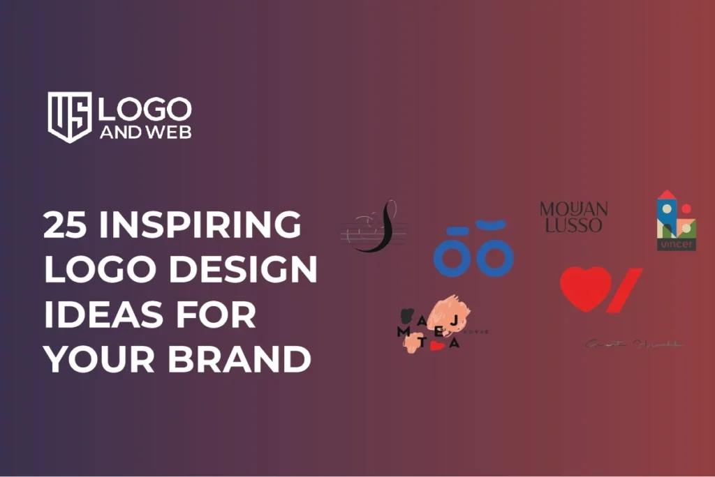
25 Inspiring Logo Design Ideas for Your Brand is a curated list of creative concepts and approaches you can use to define or refresh your logo. These ideas are based on real design trends and examples from forward‑looking brands worldwide. They help you think beyond basic shapes and fonts to build a logo that represents your story, values, and future potential.
Every brand lives or dies by how it’s seen at first glance. A great logo doesn’t just look good. It communicates who you are, what you stand for, and why people should pay attention. In a crowded market, the right logo gives you confidence, clarity, and memorability. In 2026, logo design is a blend of simplicity, adaptability, and personality. From minimalist wordmarks to bold, animated visuals, fresh ideas can spark creativity no matter your industry. In this article, we present 25 inspiring logo design ideas to guide your brand’s identity and help you make smart choices.
What are 25 Inspiring Logo Design Ideas for Your Brand?
25 Inspiring Logo Design Ideas for Your Brand is a curated list of creative concepts and approaches you can use to define or refresh your logo. These ideas are based on real design trends and examples from forward‑looking brands worldwide. They help you think beyond basic shapes and fonts to build a logo that represents your story, values, and future potential. This guide isn’t just a list of pretty graphics. It’s a strategic look at how logo design works in today’s digital world, with tips on trend adoption, meaning, usability, and emotional impact.
25 Inspiring Logo Design Ideas
Below are ideas to spark your creative process. You can mix, match, and adapt them to your brand’s needs.
- Minimalist Wordmarks – Simple type with clean lines promotes clarity and timelessness.
- Responsive Logos – Designs that adapt to screen sizes, from icons to full marks.
- Bold Typography Only – Let your font deliver personality without icons.
- Negative Space Magic – Hidden shapes make your logo clever and memorable.
- Retro and Vintage Marks – Nostalgic elements for authenticity.
- Custom Calligraphy – Handcrafted lettering adds uniqueness.
- Geometric Shapes – Abstract forms give a modern, structured look.
- 3D and Depth – Dimensional logos add a premium feel.
- Gradient Bold Colors – Dynamic color transitions attract attention.
- Monogram Letters – Compact and sophisticated identity.
- Hand‑Drawn Icons – Personal and artisanal impression.
- Eco‑Inspired Graphics – Nature elements signal sustainability.
- Abstract Representation – Non‑literal forms express brand traits.
- Slanted Motion Lines – Adds dynamism and progress.
- Soft Rounded Logos – Friendly and approachable feel.
- Minimal Icons With Symbol Meaning – Keep it simple but intentional.
- Futuristic Elements – Tech and innovation vibes.
- Layered Patterns – Depth without complexity.
- Interactive / Motion Logos – Add subtle animation online.
- Cultural Motifs – Rooted in heritage or story.
- Minimal Serif Mix – Classic but fresh typography.
- Color‑Pop Icons – One accent color for emphasis.
- Letter With Hidden Symbol – Similar to FedEx’s arrow effect.
- Badge and Emblem Style – Vintage badge feel for legacy brands.
- Playful Mascot Logos – Friendly characters for consumer brands.
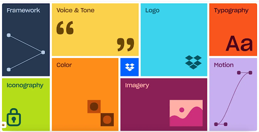
Key Features of Great Logo Design
- Simplicity keeps your mark memorable and versatile.
- Meaningful Symbols tie visuals to your brand story.
- Adaptive Design ensures flexibility across devices.
- Color Psychology affects perception and emotion.
- Custom Typography reinforces uniqueness.
- Scalability ensures clarity at small and large sizes.
- Timeless Appeal balances trend with longevity.
How to Download (Logo Files)
- Finalise your logo concept, responsive versions for flexibility and variations (full, icon, responsive version).
- Export in standard formats: SVG for web and print, PNG for transparent backgrounds.
- Save PDF for high‑quality print.
- Organise file folders by use case: web, print, social, favicons.
- Test each file across devices to confirm clarity.
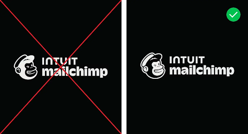
How to Win With Your Logo
Choose a logo that not only looks good but also works hard. Focus on your audience’s expectations and where the logo appears most often. Whether you’re online, in packaging, or on signage, your design should feel consistent and intentional. Avoid trendy gimmicks that date quickly and invest in adaptable versions for different platforms.
My Personal Experience
When I redesigned a brand’s logo last year, the biggest shift came from simplification. Reducing details made the logo more versatile for mobile apps and packaging. Another insight was testing color contrast in real contexts rather than only on screen. That made the final design stronger in real use.
Pros and Cons
Pros
- Communicates brand meaning at a glance.
- Scales well across platforms.
- Supports memorability.
Cons
- Trends evolve; update wisely.
- Complex logos can be costly to produce and apply.
A good logo is more than a graphic. It’s your brand’s first impression and long‑term identity anchor. By exploring varied design ideas and prioritising clarity, adaptability, and meaning, you build trust and stand out. Use this guide as inspiration, not a rulebook, and tailor visual identity to your audience and goals.
FAQs
What makes a logo inspiring?
An inspiring logo connects visual form with brand meaning and emotion.
How many logo versions should I have?
At minimum, standard, icon, and responsive versions for flexibility.
Can I design my logo myself?
Yes, start with basics and iterate; professional help improves quality.
Is animation necessary for logos?
Not required, but helpful online for engagement.