Avoiding common landing page mistakes in 2026 means focusing on clear messaging, fast loading speed, mobile responsiveness, and strong calls-to-action to improve conversions. By optimizing user experience and eliminating design flaws, you can turn more visitors into leads and maximize your marketing results.
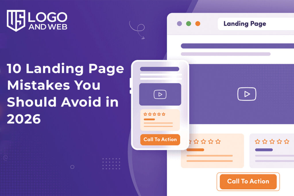
Your landing page is more than just a webpage, it’s your digital first impression. In 2026, where users have shorter attention spans and higher expectations, even small mistakes can cost you valuable conversions.
At US Logo and Web, we’ve seen businesses invest heavily in ads but lose potential customers because their landing pages fail to convert. The truth is, a great landing page doesn’t just look good it guides visitors toward action.
Let’s break down the 10 most common landing page mistakes you should avoid this year.
- Unclear Value Proposition
When someone lands on your page, they should instantly understand what you offer and why it matters.
If your headline is vague or confusing, visitors will leave within seconds.
Fix it:
Use a clear, benefit-driven headline that answers:
“What do I get, and why should I care?”
- Too Much Information
Many businesses try to explain everything at once. This overwhelms users and reduces conversions.
In 2026, simplicity wins.
Fix it:
- Focus on one goal
- Keep your message short and clear
- Remove unnecessary text
Less content, but more impact.
- Weak Call-to-Action (CTA)
A landing page without a strong CTA is like a store without a checkout counter.
Generic buttons like “Submit” or “Click Here” don’t inspire action.
Fix it:
Use action-oriented phrases like:
- “Get Your Free Quote”
- “Start Your Project Today”
- “Claim Your Offer Now”
Make your CTA impossible to ignore.
- Slow Page Load Speed
Speed matters more than ever. If your page takes too long to load, users will leave before even seeing your content.
Fix it:
- Optimize images
- Use a lightweight design
- Avoid unnecessary scripts
A fast page keeps users engaged and improves conversions.
- Not Mobile-Friendly
In 2026, most users browse on mobile devices. If your landing page isn’t optimized for smaller screens, you’re losing a huge audience.
Fix it:
- Use responsive design
- Keep buttons easy to tap
- Ensure text is readable on all devices
Mobile experience is no longer optional it’s essential.
- Lack of Trust Signals
People don’t convert if they don’t trust you.
Missing reviews, testimonials, or credibility indicators can hurt your performance.
Fix it:
Add:
- Customer testimonials
- Client logos
- Ratings or reviews
- Guarantees
Trust builds confidence, and confidence drives conversions.
- Poor Visual Hierarchy
If everything on your page looks equally important, users won’t know where to focus. This often happens when proper structure and On-Page SEO Services are overlooked. As a result, it leads to confusion and missed opportunities.
Fix it:
- Use headings and subheadings
- Highlight key points
- Guide the user’s eye toward your CTA
Your design should lead users step-by-step.
- Too Many Distractions
Pop-ups, multiple links, and unnecessary elements can pull users away from your main goal.
A landing page should have one purpose.
Fix it:
- Remove navigation menus if not needed
- Avoid too many links
- Keep the user focused on one action
Clarity increases conversions.
- Ignoring User Intent
One of the biggest mistakes is creating a landing page that doesn’t match what users are looking for.
If your ad promises one thing and your page delivers another, users will leave immediately.
Fix it:
Ensure your landing page:
- Matches your ad or keyword
- Delivers exactly what was promised
- Speaks directly to your target audience
Consistency builds trust and improves results.
- No A/B Testing
Many businesses create a landing page and never update it. This is a missed opportunity.
In reality, even small changes can make a big difference.
Fix it:
Test different versions of:
- Headlines
- CTAs
- Images
- Layouts
Continuous improvement is the key to higher conversions.
Bonus Tip: Overdesigning the Page
While design is important, too many animations, colors, or effects can distract users.
Fix it:
Keep your design clean, modern, and focused on usability.
What a High-Converting Landing Page Looks Like in 2026
To succeed this year, your landing page should be:
✔ Clear and focused
✔ Fast and mobile-friendly
✔ Visually structured
✔ Trustworthy
✔ Action-driven
At US Logo and Web, we believe that the best landing pages are those that combine strategy, simplicity, and user experience.
Final Thoughts
Landing pages are powerful tools—but only when done right. Avoiding these common mistakes, along with adding keywords for SEO in a natural and strategic way, can dramatically improve your conversions, reduce bounce rates, and increase your return on investment. Remember, success doesn’t come from adding more elements—it comes from removing what doesn’t work and focusing on what truly matters. In 2026, the winning strategy is simple:
Create landing pages that are clear, fast, and built for real users—not just search engines.
FAQs
What is the most common landing page mistake?
The most common mistake is having an unclear value proposition that confuses visitors.
How many CTAs should a landing page have?
Ideally, one primary CTA to keep the user focused on a single action.
Why is mobile optimization important?
Most users access websites through mobile devices, so a poor mobile experience leads to lost conversions.
How can I improve landing page conversions?
Focus on clarity, speed, strong CTAs, and trust signals while continuously testing your page.
Is design more important than content?
Both matter, but content drives the message while design supports user experience.